Yasna.ai - our AI platform for conversational research
The Joy of Doing Nothing:
How Expedia's Ads Play on the Desire to Escape It All
How Expedia's Ads Play on the Desire to Escape It All

Anna Kupriyanova
Marketer
The general consensus is that ads are annoying and inescapable, yes. But what if an ad focuses on escaping?
We are alluding to the realm of advertising related to vacations. A rare person these days wouldn't add "travel" to their list of hobbies / bucket-list activities / life-style goals. So, when consumers see an outdoor advertisement that is meant to trigger that travel bug, what reaction does it provoke?
Before we get into the meat of this case study, let's get to know our target audience a bit better: how far in advance they plan their holidays, what they travel for and with whom.
METHODOLOGY
Stimuli: three ads by Expedia.
Target: United Kingdom, male, female, from 18 to 54 years, 300 respondents in total.
Research Solution: Visual test — a ready-to-use research solution by Fastuna (online survey).
Stimuli: three ads by Expedia.
Target: United Kingdom, male, female, from 18 to 54 years, 300 respondents in total.
Research Solution: Visual test — a ready-to-use research solution by Fastuna (online survey).
Spontaneous solo-travelling is definitely not popular. So, what is?

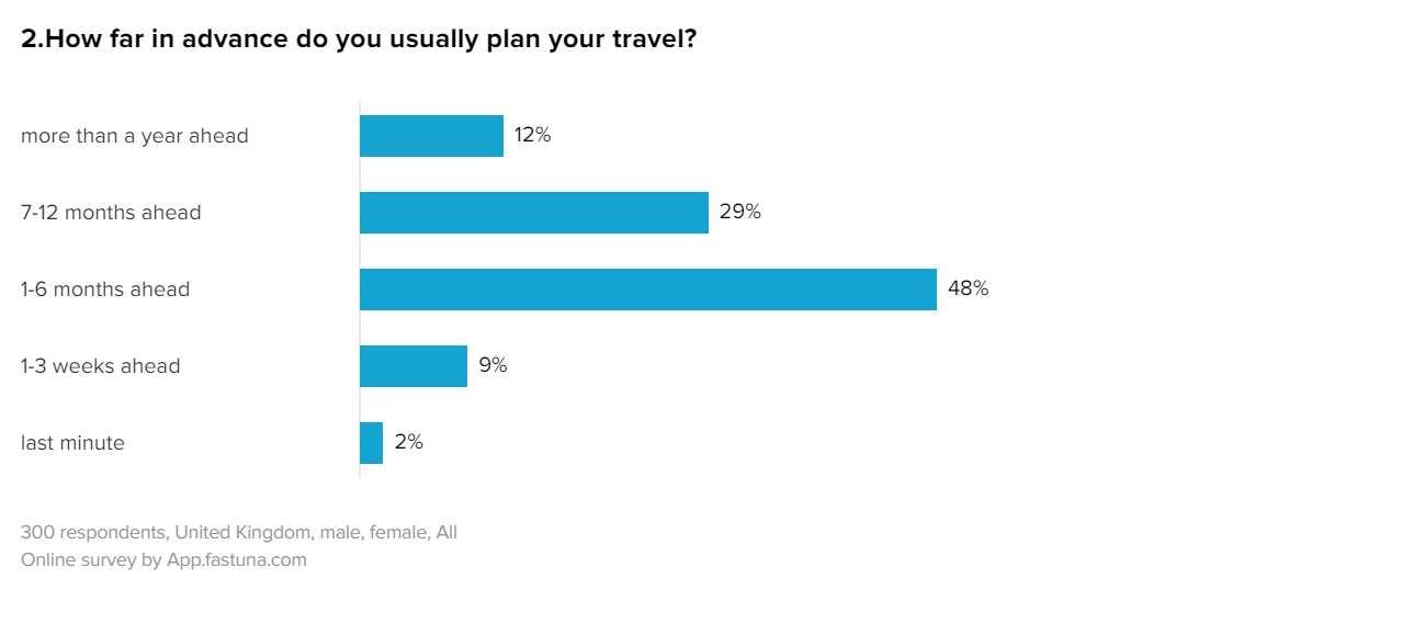
Almost half of our respondents in the UK plan their travel 1 to 6 months ahead of time, 12% like to be extra diligent and make arrangements a year ahead and only 2% are last minute planners.
An overwhelming majority (85%) travel to rest and recharge, 81% like to gain new experiences and learn new things, 66% enjoy visiting places that inspire nostalgia while another 64% look for adventures in their travels. Finally, 39% are driven by pop culture and travel to visit places they saw in tv shows and films.
An overwhelming majority (85%) travel to rest and recharge, 81% like to gain new experiences and learn new things, 66% enjoy visiting places that inspire nostalgia while another 64% look for adventures in their travels. Finally, 39% are driven by pop culture and travel to visit places they saw in tv shows and films.

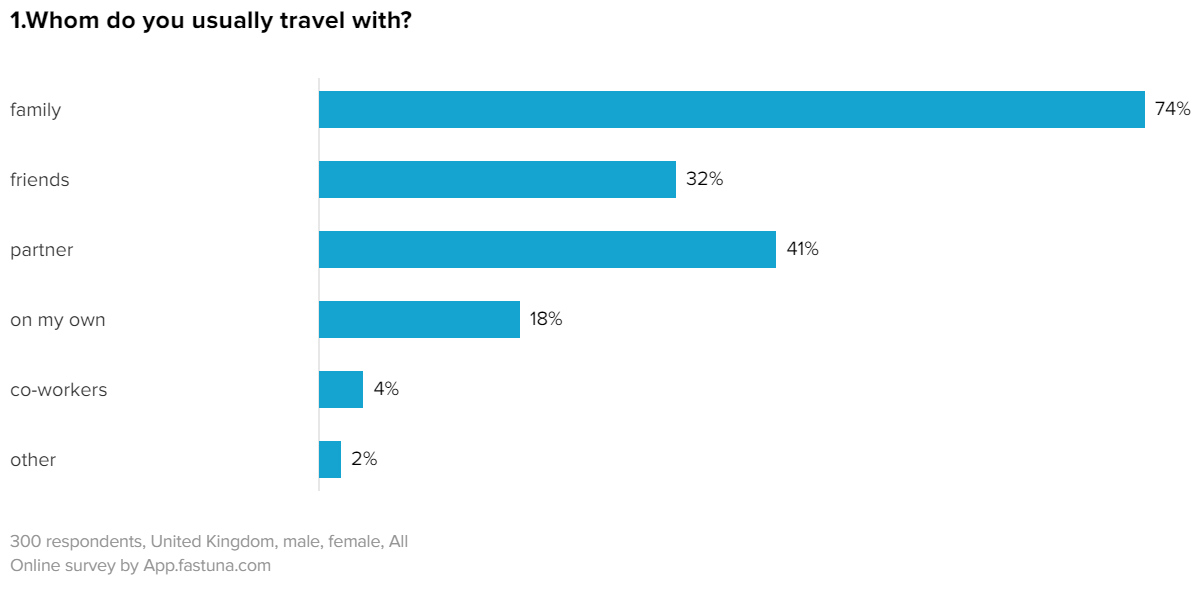
74% travel with family, 18% are solo-travellers, 41% go vacationing with partners and 32% with friends. Trips with co-workers come in next to last, at 4%.
These statistics are mostly reflected in three different OOH (out-of-home) ads by Expedia. Take a look at the images and ask yourself if you feel the same way as one of our respondents, who said:
These statistics are mostly reflected in three different OOH (out-of-home) ads by Expedia. Take a look at the images and ask yourself if you feel the same way as one of our respondents, who said:
“
It makes me automatically want to go on Expedia and book a holiday - Female, 34
Serenity and unreachability: a recipe for relevance
If nothing else, the images evoke a sense of peace. In all three ads people are clearly busy doing one thing and one thing only: relaxing. Someplace where it would probably say "no network connection" if you attempted to use the internet. There is no laptop, phone or other attribute of daily life in sight.
“
It is just what I seek in everyday life as well as holiday. Rest, relaxation in a peaceful environment - Male, 48
The slogans in the ads follow the same idea, they all play on the desire to block out the world with its to-do lists, obligations and endless emails. This should appeal to the 85% of respondents who said their goal when travelling was to rest and recharge. Our research results support this assumption:

All three ads are well-liked even if the scores are marginally different
Unsurprisingly, people liked the ads, all three scored above average. However, there is a looming question. Why aren't the ads in the '25% of the best' score category? What went not completely right? To get a better understanding of the consumer's attitude let's turn to the detailed chart with 9 different metrics. These are based on the AISAS model which helps explain consumer behaviour.
Liked but lacking clarity

Test advertising and information images, banners, leaflets, posters, and stickers with Fastuna. Which option is better? What to improve? Getting actionable results only requires 15 minutes of your time. Book a call to learn more.
So we already know the ads were liked. But the truly winning metrics are Uniqueness, Relevance, Believability.
One clear outlier in this nearly idyllic picture is Clarity. All ads missed the mark on this one. By looking at the comment section we pinpoint why that is:
Not enough details and somewhat confusing wording. The images and slogans are minimalistic, "pretty non-descriptive" and "vague". The respondents figured out that some sort of holiday was advertised, but were not sure what or where. There is a general sense of frustration best illustrated by this line:
“
I realise that it's saying RELAX but I want to know more about the destination of a holiday - Male, 49
Despite the lack of Clarity, the ads are still effective. After all, the most important metric, Desire to purchase a holiday, is high for all three images. It seems possible that not giving out information plainly and, instead, hinting at the types of destinations and sensations that Expedia holidays can provide is exactly how the ad creators make consumers linger and eventually book their next vacation. Perhaps, somewhere where emails can't find them?
Request Free Demo
Fastuna is an agile market research platform for getting consumer feedback on your product and advertising ideas within 24 hours. Just leave us your contact details and we will be in touch with you shortly!
Innovate with confidence
Validate product and marketing decisions with real people in 24h using our hassle-free testing tool
